

In our data-driven world, the ability to represent complex data sets in meaningful ways is a critical skill. Today, we will highlight the usage, benefits, and practical application of one of the most effective tools in the data visualization toolbox – the spline chart. This chart is truly versatile – whether you’re a business analyst seeking to interpret your company’s financial trends or a researcher tracking environmental changes over time. Keep reading to explore more about data visualization and spline charts in this comprehensive guide.
Table of Contents
Understanding the Basics of a Spline Chart
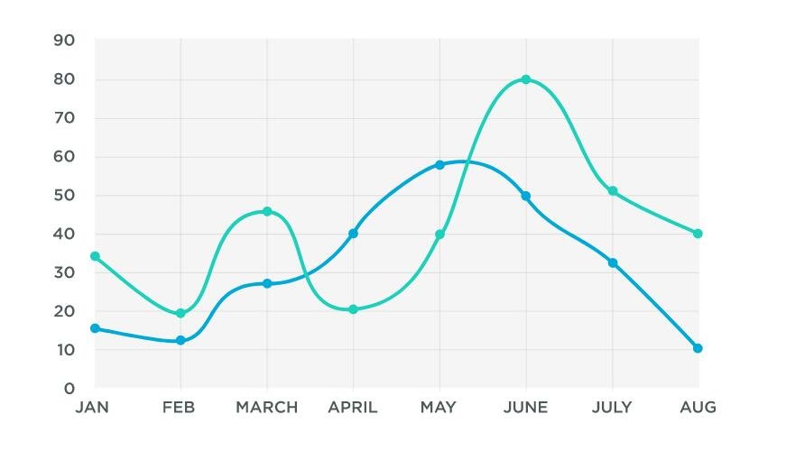
A spline chart, in simple terms, is a graphical representation of data that uses a series of curved lines to connect the data points rather than using straight lines. This gives the chart a smooth appearance and can make patterns in the data more evident.
A spline chart is an excellent data visualization tool for showcasing large datasets and identifying trends, patterns, and possible outliers. The data represented by a spline chart can be related to multiple domains, including business performance, sales, scientific research, climate change, etc.
A prime benefit of the spline chart is that it reduces the sharp angles of the conventional line chart. It offers a visual appearance that makes it easier for viewers to observe the overall trend of the data.
Further, the spline chart excels in showcasing the data fluctuation. This makes it an invaluable tool for analyzing data with continuous fluctuations like stock market trends, temperature changes, or seasonal variations in sales.
Exploring the Purpose and Role of Spline Charts in Data Analysis
Spline charts play an essential role in data analysis. They are particularly beneficial when dealing with continuous data that display a trend or pattern. Splines offer a granular view of such data, making them invaluable for detailed trend analysis.
The unique structure of the spline chart makes it ideal for showcasing diverse trends in a data set. The curvature of the line can capture small variations that may be overlooked in other graph types.
Moreover, spline charts can present multiple datasets simultaneously. This trait enables viewers to compare and contrast different trends on a similar time axis, providing comprehensive insights. Besides, spline charts are not restricted to stable time intervals. They can depict data collected at irregular intervals, providing more flexibility in data representation.
These capabilities make the spline chart an indispensable tool in an analyst’s repertoire, delivering unparalleled depth in data understanding.
Appropriate Situations to Employ a Spline Chart
So, when is it appropriate to use a spline chart? The short answer is — it depends. The choice of a spline chart depends on the data being analyzed and the goal of the analysis. Spline charts are most beneficial when visualizing large datasets with a continuous variable and when you need to identify precise trends in the data.
For instance, in cases where you need to visualize the long-term trends in climate change, spline charts can be instrumental. They smooth out short-term fluctuations, enabling viewers to evaluate and understand the overall pattern of change.
Another situation where spline charts prove effective is when visualizing financial data. Trends in financial data like stock prices, revenue, or costs can be explained smoothly with this chart type.
However, if your data consists of discrete variables or if the underlying trend isn’t crucial to your analysis, a different chart type might be more appropriate.
Key Takeaways and Best Practices in Using Spline Charts
Much like any other chart type, the key to effectively using a spline chart lies in understanding when and how to use it properly. As spline charts are smoothed versions of line charts, they are best used when you have a large dataset and want to see a smoother overview of your data’s trend.
When it comes to representation, make sure to properly label your axes, maintain a suitable scale, and choose colors that make the data stand out. This will help to avoid misinterpretation of your data.
Multiple data series can easily be visualized on a single spline chart. Be careful, though, not to clutter your graph with too many lines, as it can make your graph confusing and hard to read.
Lastly, it is always good to remember that while spline charts can be advantageous for portraying large datasets with continuous variables, they can lead to misleading results if not used thoughtfully. Therefore, taking your time to understand and interpret the data correctly is imperative to drawing meaningful and accurate conclusions.
Altogether, spline charts, when used appropriately and with due diligence, can truly enhance your data visualization capabilities, leading to deeper insights and more informed decision-making.